
Word of the Day: Blanding
The blandification of everything: homes, interiors, coffee shops, clothes, logos, taglines.

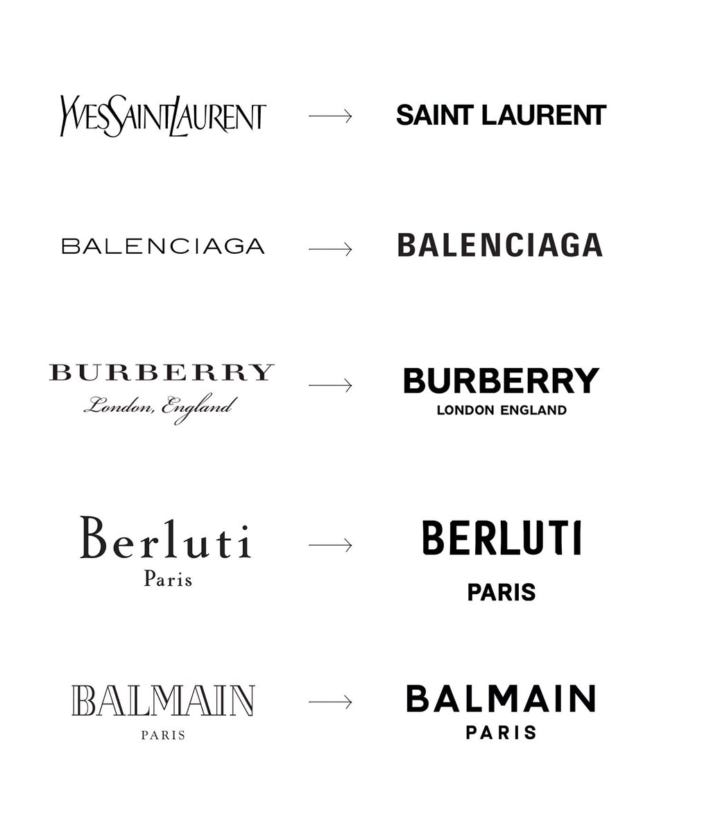
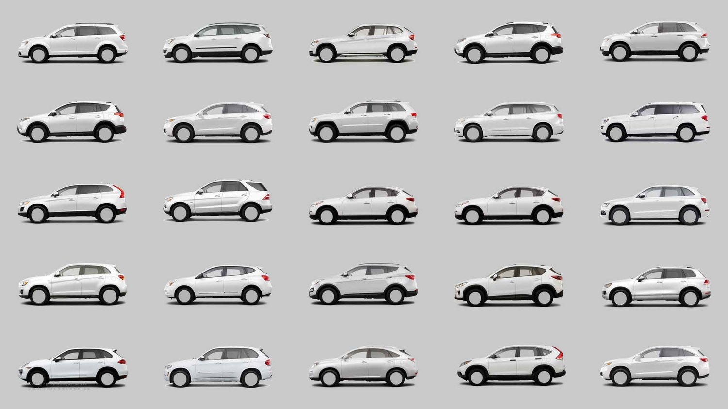
Blanding refers to the cross-market phenomenon of brands adopting similar minimalist aesthetic cues.
Ruled by the dictum “less is more,” blanding is often embodied by the following branding elements:
Sans serif fonts
Clean lines
Limited color palette
Overall simplification
Blanding is a visual brand identity that’s:
Controlled
Ahistorical
Flat
In the eyes of consumers, blanding branding efforts are often feel:
Current
Agreeable
Sanitized
Blanding, by definition, is a move toward looking the same in an effort to feel familiar.
The style can be seen across all sectors, and major companies are hiring rebranding agencies to fit the new trend. But as a creative branding agency ourselves, it makes us ask the question:
If the point of branding is to express what makes you unique, why is blanding so popular?
| Karen Maxwell, What is “Blanding” and Why are So Many Brands Doing It?
Ben Schott writing for Bloomberg:
“Visually, blands are simple, neutral and flat. The palette is plain and pastel (with the occasional vibrant splash); the mood is upbeat and happy, or pensive and cool, but never truly real; the dress-code is smart-casual. Bland people are stock-photo attractive (or quirkily jolie laide). (…) Complex products and technical processes are illustrated by cute cartoons or Noun Project icons. Bland logos are confident but cute, utilizing an array of tweaks and twists to provoke the all-important “smile in the mind”.”
While the tech sector has led the way on blanding, we see the trend towards flatter, more lifeless, identities playing out in categories from the high-end world of fashion to the more mass world of personal care.
In a November 2021 article, title Distinction Rebellion, Contagious claimed that more and more brands seem content to drift along in a sea of sameness:
“Look up any new corporate brand identity unveiled over the past decade and you will almost certainly find yourself staring at a flattened and simplified version of the company’s old logo. The aesthetic has become so ubiquitous that it’s acquired its own name – blanding.”
So, advertising and brand identities are becoming more and more alike.
| Alex Murrel, The Age of Average